At Silver Birch Games, we’re keen to make our games as accessible as possible, and that means taking steps to include an often-overlooked group of people whose particular condition affects board game play.
Colour blindness affects 4.5% of the population – that’s roughly 1 in 20 people. This figure is heavily skewed towards men, with around 8% of men being colour blind, compared to 0.5% of women.
That’s a pretty substantial group of people, yet traditionally games have always tended towards the default palette of red, blue, green and yellow, which are entirely unsuitable for colour blind people – especially green, with red/green and blue/green colour blindness being the most common forms. Even today many games are produced that are difficult for colour blind people to play. We intend to ensure that all our games are colour blind friendly and will always welcome feedback if you’ve found our games not to be.
What our colour pallette looks like with major colour blind types
It’s been an interesting journey taking on this issue as game designers ourselves. When designing with colour blindness in mind, we’ve learned that the best rule to follow is if it works in black and white, it’ll work for anyone. For Deckchairs on the Titanic, we achieved this by using distinct icons on the board along with a colour palette that can be distinguished by using a range of light to dark shades of the colours we chose.
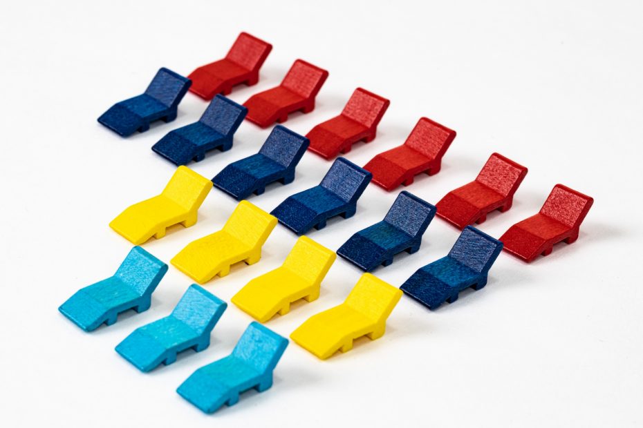
The colours themselves were developed from the Coloursmash palette. Because the ice block is white, we couldn’t use that as a player colour. As a result, we decided not to use black either. Using the Coloursmash palette, we selected a set of dark red, dark blue, light yellow and cyan colours.
We checked these using online tools that simulate colour blindness, and with some slight adjustments to increase the distinction in shades between the dark and light colours, we had our palette for the game.
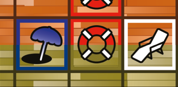
Once the review copies were printed we were able to get the physical game in front of some colour blind people for a final check, but we found an unexpected problem. It turned out the player pieces and colours were all easily distinguished, but the red shade we’d used for the icons and space outlines on the board blended into the browns of the deck! It wasn’t something we’d even considered and goes to show how important it is to get real world feedback.
When the space is occupied, the icon is covered and the red border marking the square blends into the brown borders and decking.
We’ll be adjusting this for the production edition by introducing some patterning, so that players can still see the scoring spaces easily when the icons are covered by deckchairs or the ice block.
With the board sorted, we’re now looking at ways to increase the distinction between the deckchair pieces. At the moment we have one shape designed, but we’re going to have Kickstarter stretch goals to change this into different designs for each colour.
If you’re colour blind we’d really appreciate your thoughts on our design. As with any accessibility issue, please let us know what we can improve.